Client
Dooable Health
Services
UX/UI, and Mobile
Dooable Health is a team of nationally board certified health coaches and health benefit consultants who seek to help companies and individuals envision personal transformations, and attain their health goals. Dooable offers an array of wellness benefits including personalized health coaching sessions, health workshops, and access to a full library of lessons on eating, movement, and living well – all accessible via their web application.
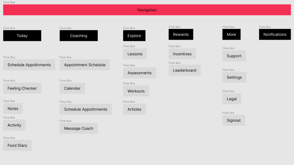
However, Dooable found their customers had challenges navigating their web app and sought to improve the design and user experience (UX) of their existing client-facing interface. With the help of CrossComm’s design team, a UX audit and redesign led to a revamped app with easy-to-navigate mobile screens, a smoother flow of information architecture, health data visualizations, and a vibrant rebranding of Dooable’s design aesthetic.
Our Approach
UX Audit
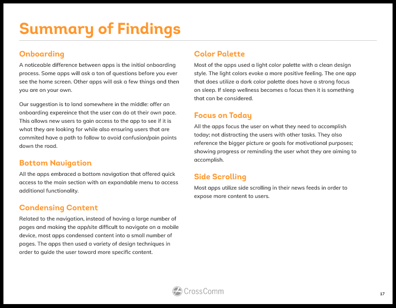
A UX audit can provide guidance on meaningful improvements through the assessment of design strengths and weaknesses. For Dooable, CrossComm gathered information and insight from UX research, competitive analysis, and developing user personas and customer journeys. These steps allowed Dooable to be equipped to avoid common design pitfalls, and prioritize app features that appeal specifically to their clients.
UX Research
CrossComm's first step in a UX audit is determining a product’s strengths, while identifying pain points and usability concerns. The design team looked for ways the existing web app succeeded or fell short of being user-centric, assessing for usability flaws such as poor navigation, design clutter, and missing functionality. During the research process, CrossComm examined any gaps between the existing design and information architecture, and Dooable’s purpose and objectives for the app.
Competitive Analysis
An integral part of a UX audit is an analysis of the competitive landscape. CrossComm's UX team took a deep dive into the people and companies that make up Dooable’s potential competitors. The UX team assessed competitor strengths and weaknesses to identify opportunities for improvement, as well as key design takeaways. Through competitive analysis, CrossComm determined possible features and differentiators that can help Dooable stay ahead of design trends.
Developing User Personas & Customer Journey Maps
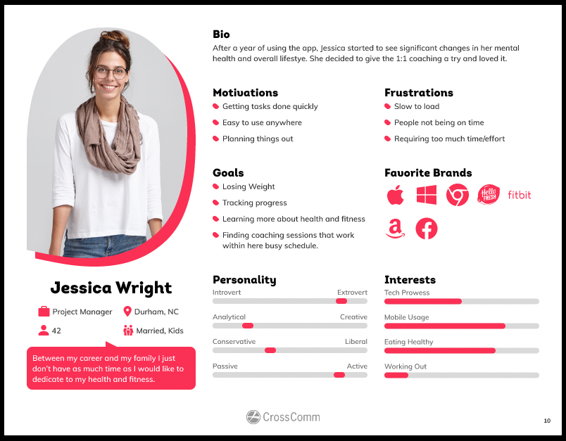
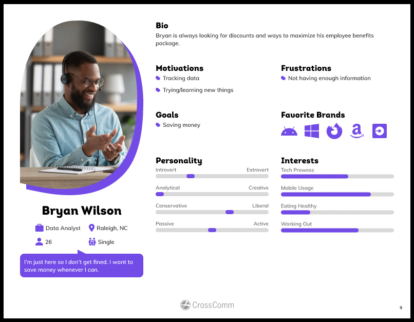
Understanding user concerns and motivations are crucial to a successfully designed product. CrossComm’s design team additionally guided Dooable through the creation of user personas to better understand their target users. To develop the personas, CrossComm gathered information about potential customers from interviews with Dooable’s health coaches, directors, and key executives. The conversations led to archetypal personas whose characteristics represent the behavior patterns, motivations, frustrations, brand preferences, and goals of Dooable’s users.
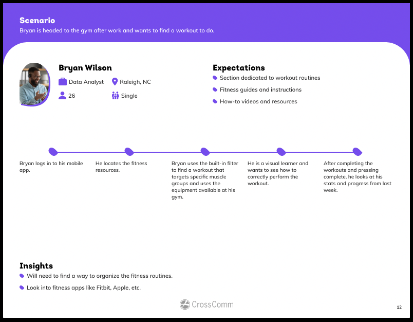
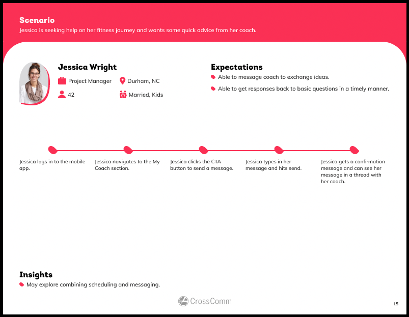
Once user personas were completed, the UX team broke down multiple scenarios to determine how customers might engage with the Dooable app. The personas and scenarios culminated in customer journey maps that articulate app touchpoints and interactions based on user expectations and goals. Mapping also has the added benefit of informing how a customer will navigate and consume content on the app. By being able to review the critical touch points, journey maps reveal strategic ways the app interface could be optimized for a smoother customer experience.
Audit Report of Findings and Recommendations
At the completion of the UX audit, CrossComm delivered a detailed report with findings and recommendations. Assessments and data gathered through the audit process allowed for informed decision-making on design and branding pivots. The detailed audit report included actionable steps and insight that were critical in the revamping of Dooable’s client interface and overall app redesign.
Redesign
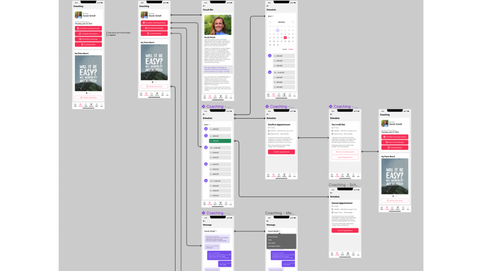
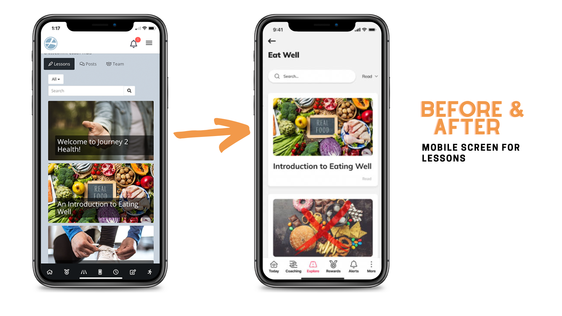
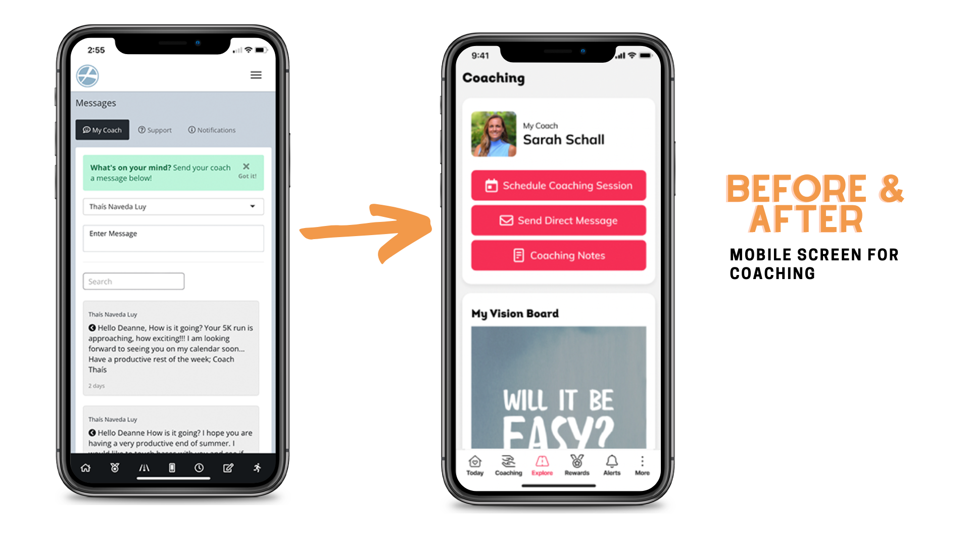
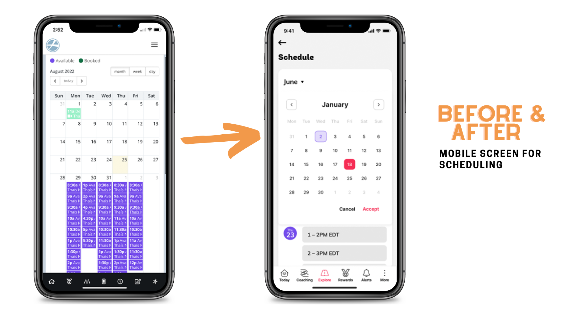
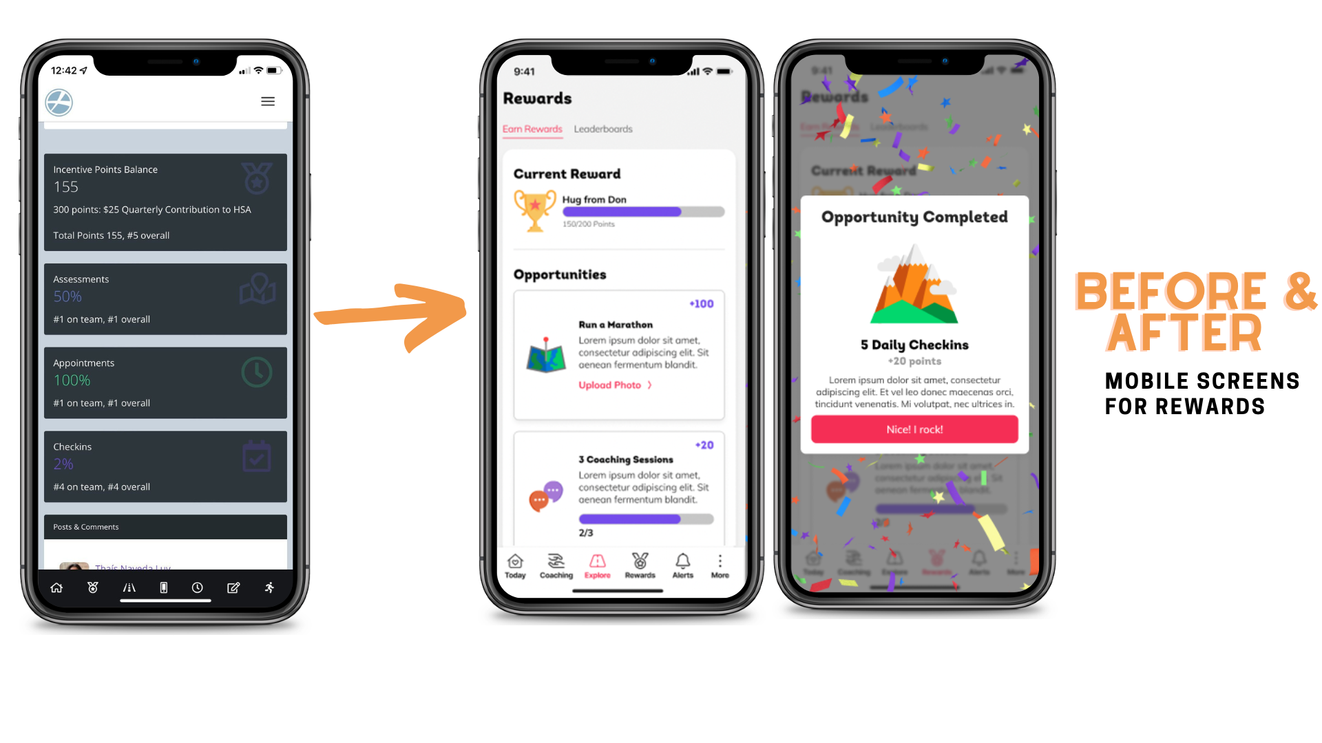
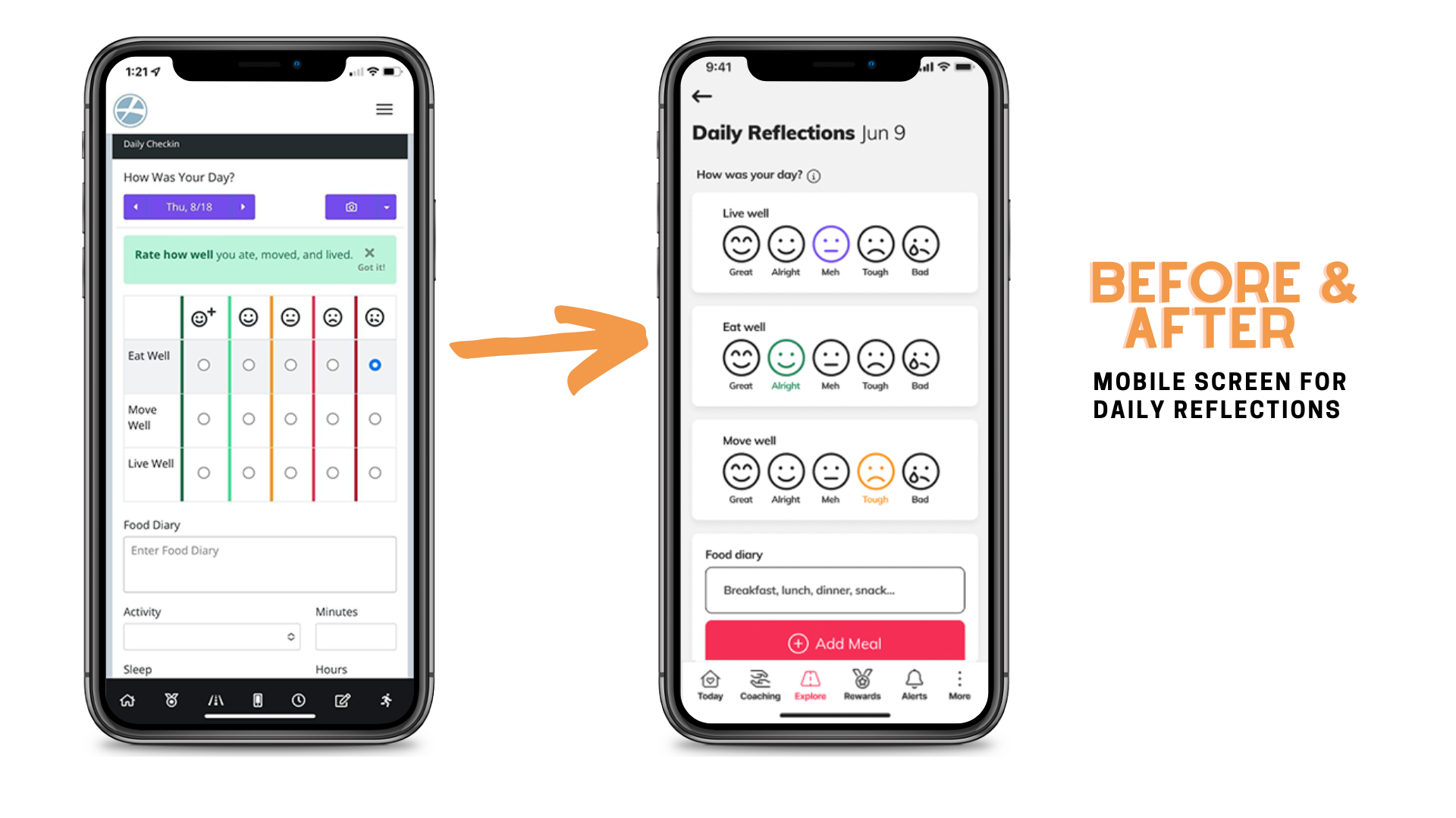
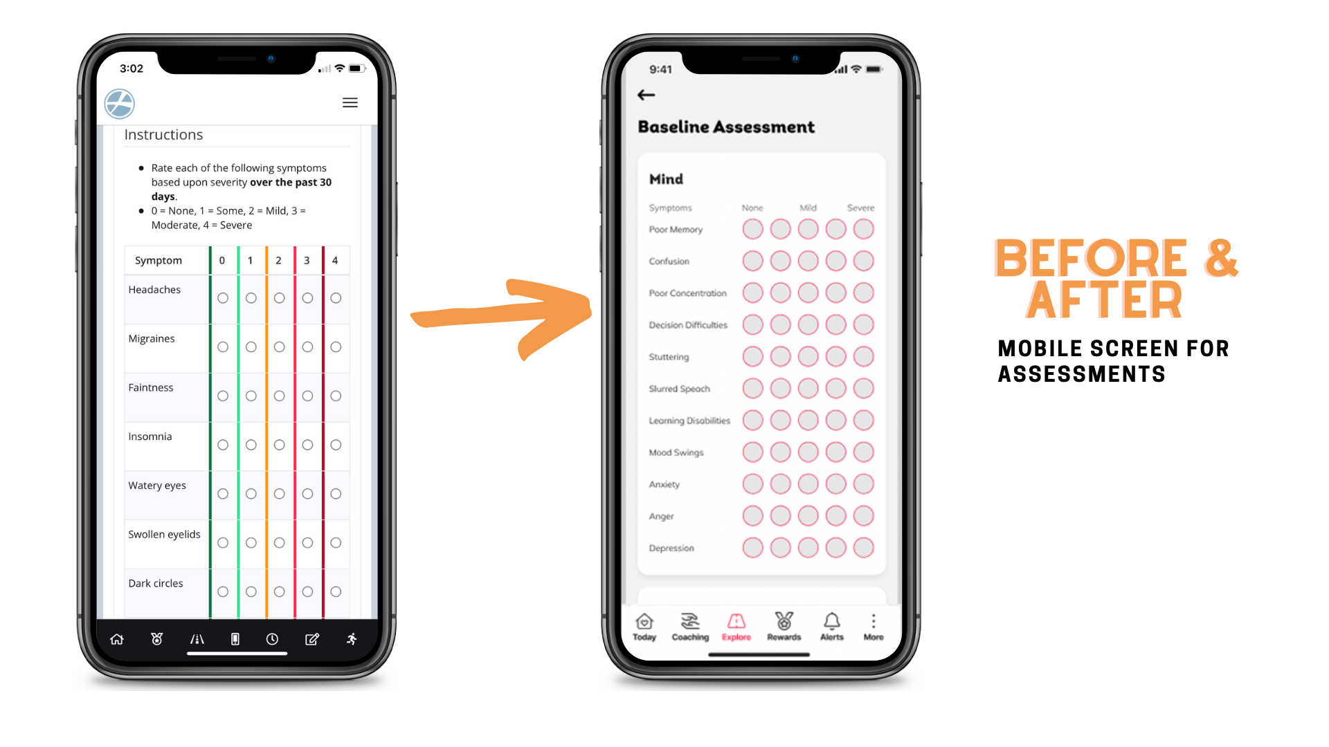
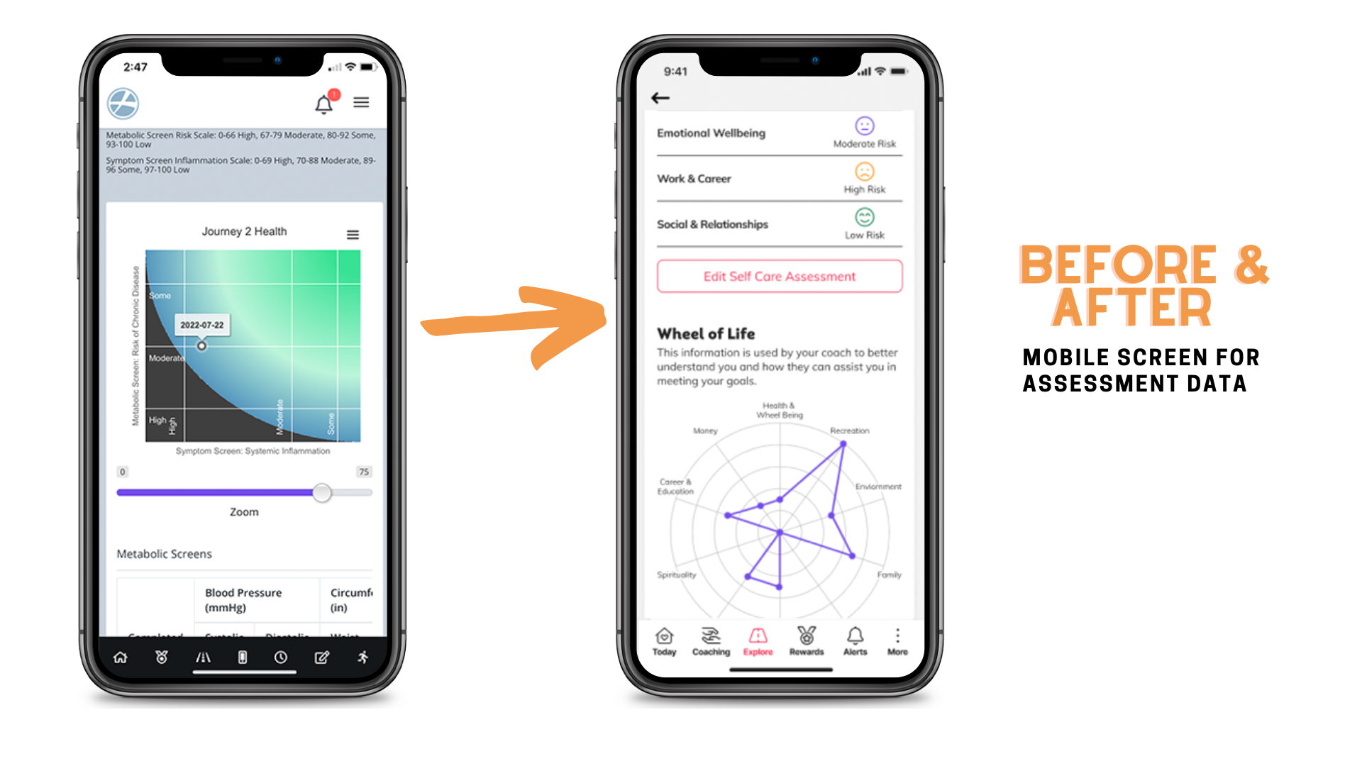
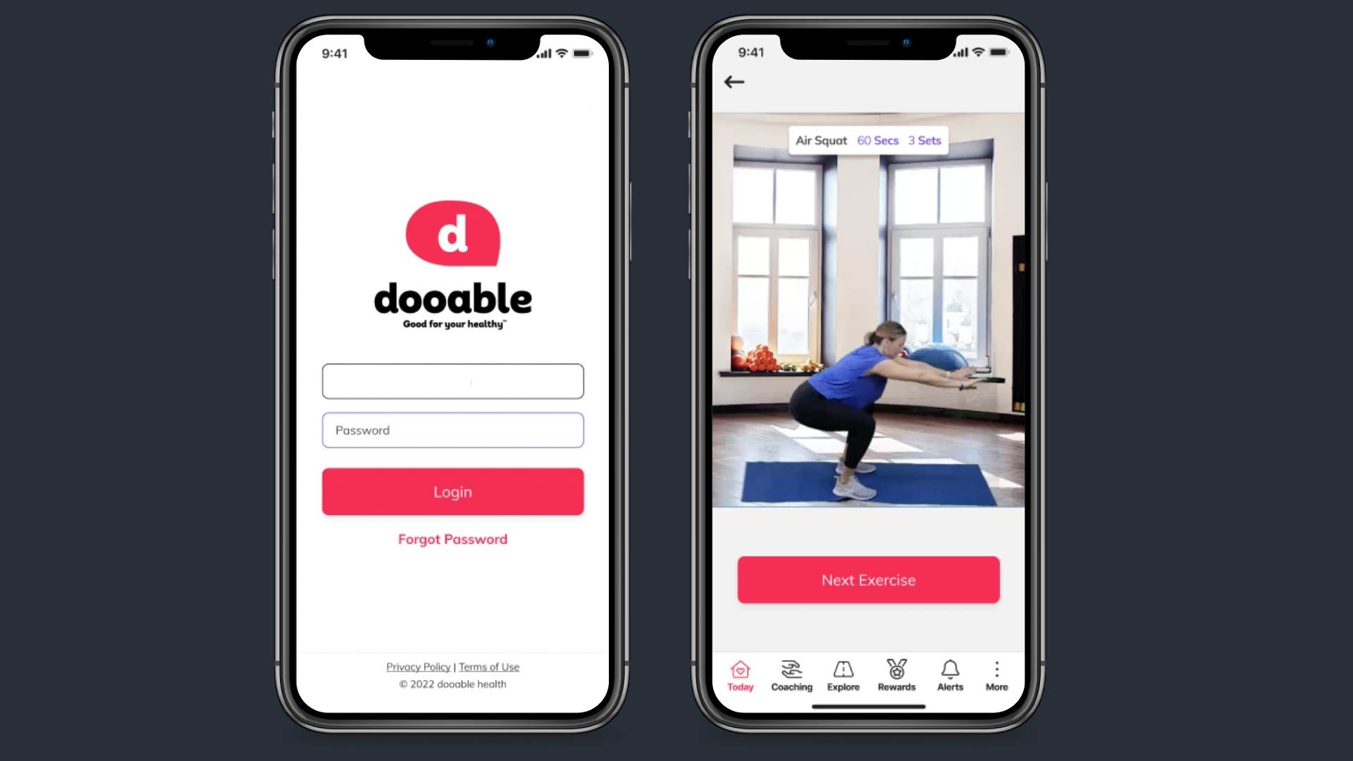
Based on findings from the UX audit, CrossComm completed a redesign to improve the existing mobile screens. Designers created wireframes and mockups that adhered to UX best practices and the latest industry trends. The mobile design solutions crafted included improved navigation flow to better guide users through the app, light vibrant colors, and focused, simple content from screen to screen. The following sections provide before and after snapshots showcasing the new design features that improve on the existing mobile screens.
Smooth User Experience
CrossComm redesigned the Dooable experience to ensure users can engage with the app at their own pace. This means that any customer can easily gain access to the app and know where to start. Likewise, committed users have a clear path to follow that allows them to move from coaching, lessons, and other sections that encourage positive health and well being. As an example, CrossComm’s designers incorporated simple and clean navigation icons and buttons. This allowed for quick access to main sections, and for a smoother flow to relevant subsections.
Focused Content and a Clean Design Style
CrossComm designers additionally recommended a pivot to a lighter color palette. During UX research, our designers found that the existing darker colors were typically associated with sleep in the wellness space. The UX designers recommended a red-on-white design, with flourishes of other vibrant colors, evoking a positive can-do feeling that communicates movement and action. In terms of content, CrossComm redesigned screens with a more focused approach, ensuring ease and accessibility of information and data that helps users accomplish personalized tasks, rather than being distracted by other tasks in the app.
Results
CrossComm completed Phase I of Dooable Health’s audit and redesign, which included the UX audit with summary of findings, and finalized mobile screens, icons, and wireframes. CrossComm is currently working with Dooable on Phase II, with creative focus on revamping the client and coaching desktop screens. The actionable design recommendations and mockups delivered in Phase I have set the foundation for an improved web application that supports the needs of Dooable’s customers, so that they could feel ready to take on their personal journey towards better health.
If you’re interested in taking the next design step in your product or idea, we would love to hear from you and discuss whether CrossComm would be the right design team for you. Tell us more and receive a free assessment from CrossComm.
