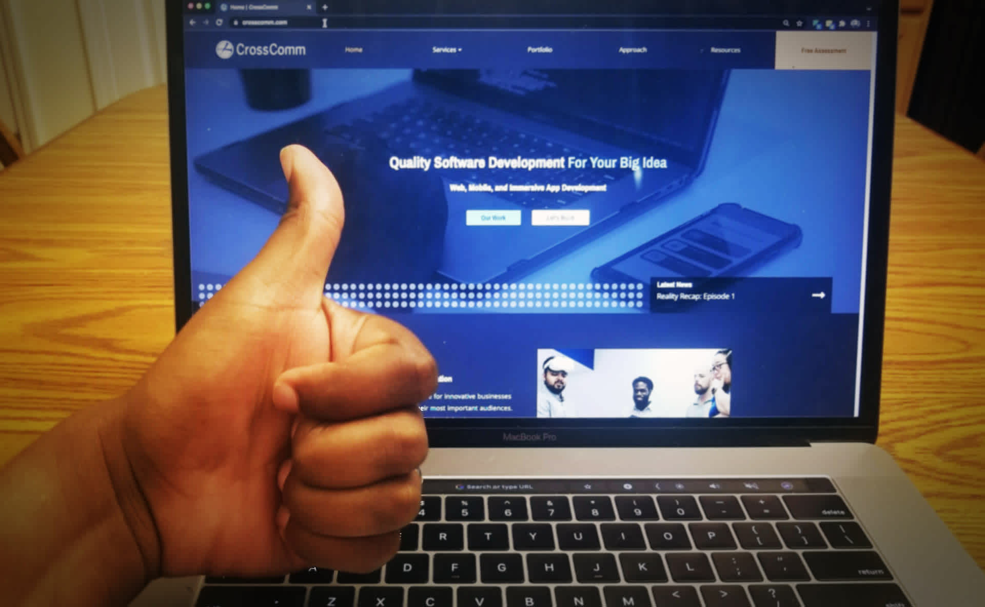
A couple of weeks ago, CrossComm launched our brand new website and I, for one, could not be more excited! I have been wanting to update our website for a while now, but relaunching a website is a big undertaking, and the timing needed to be right.
Welcome to CrossComm's New Website
Well...now was the right time. The CrossComm team has been growing, giving us the right assortment of people to assist in building the site, and even more people ready to contribute content once the site was complete.
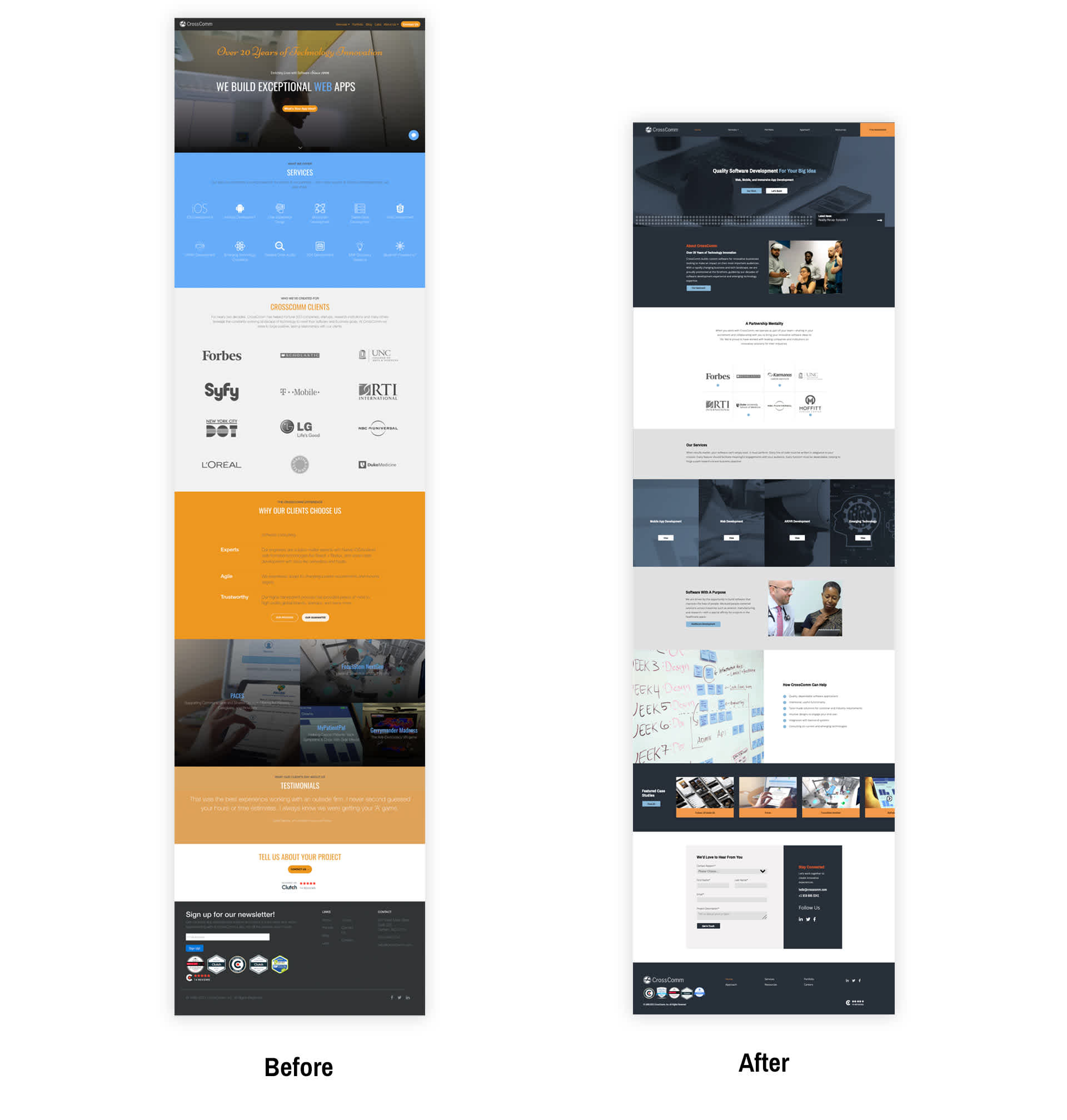
Zoomed out before and after of our home page
The three main reasons I wanted to update our website were:
To better communicate our culture, mission and services
To give the marketing team greater flexibility and "editability"
To better accommodate our growing arsenal of content
Communicating Culture, Mission and Services
In most cases, a company’s website is their digital home base. It’s often what people search for when trying to learn more about a company. Therefore, it must be effective at explaining who your company is, what it does, and what it stands for.
In our case, I wanted our site to communicate CrossComm’s experience, creativity, collaborative spirit, and desire to help. Here are some of the ways we sought to enhance this messaging in our new website.
Colors of CrossComm
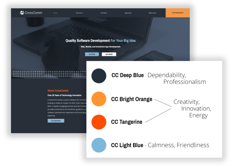
Our color palette was chosen to emphasize different elements of CrossComm’s personality. Based on the psychology of colors, dark blue is often associated with professionalism and dependability, light blue is associated with calmness and friendliness, and oranges are associated with creativity, innovation and energy.
Customer-Centric Copy
We focused on written content that addressed the needs of our potential clients and their end users in order to help them better evaluate our ability to support them.
A Human Touch
Like the old website, our new site features images of software we’ve built, but we also wanted to show the team behind the software. When we hire new team members, we search for creativity, empathy, helpfulness, and passion — so our team is our most valuable ingredient for building great software and fruitful client relationships.
Emphasizing Experience
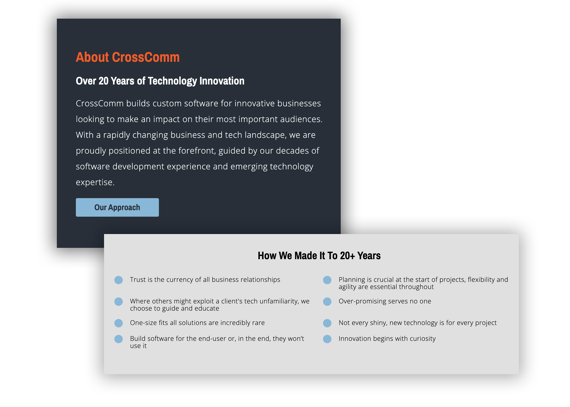
We’re proud of our longevity as a company because it means we are well-positioned to help clients navigate the changing technology landscape. We felt this was important for us to highlight throughout the site.
Highlighting Healthcare
While CrossComm serves many different industries, we’ve done a ton of work in healthcare, and these projects are also in strong alignment with our company’s core values. For these reasons, we made it a point to emphasize our work and capabilities in this space on our home page and throughout the site.
The Circle Motif
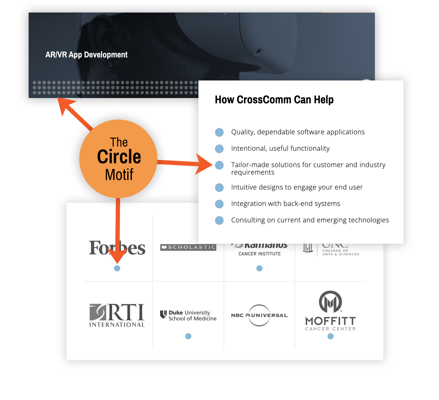
The repetition of circles throughout the site is not only a nod to the circle in our logo, it also reinforces feelings of unity, relationships and friendships—which is how we view our ideal collaborations with clients.
Points of Proof
We can talk about ourselves all day long, but we prefer not to. Plus, talk is cheap. We decided to call greater attention to points of proof like testimonials and badges we’ve earned so that clients could have third-party sources to engage with and evaluate us by.
Brand New “Approach” Page
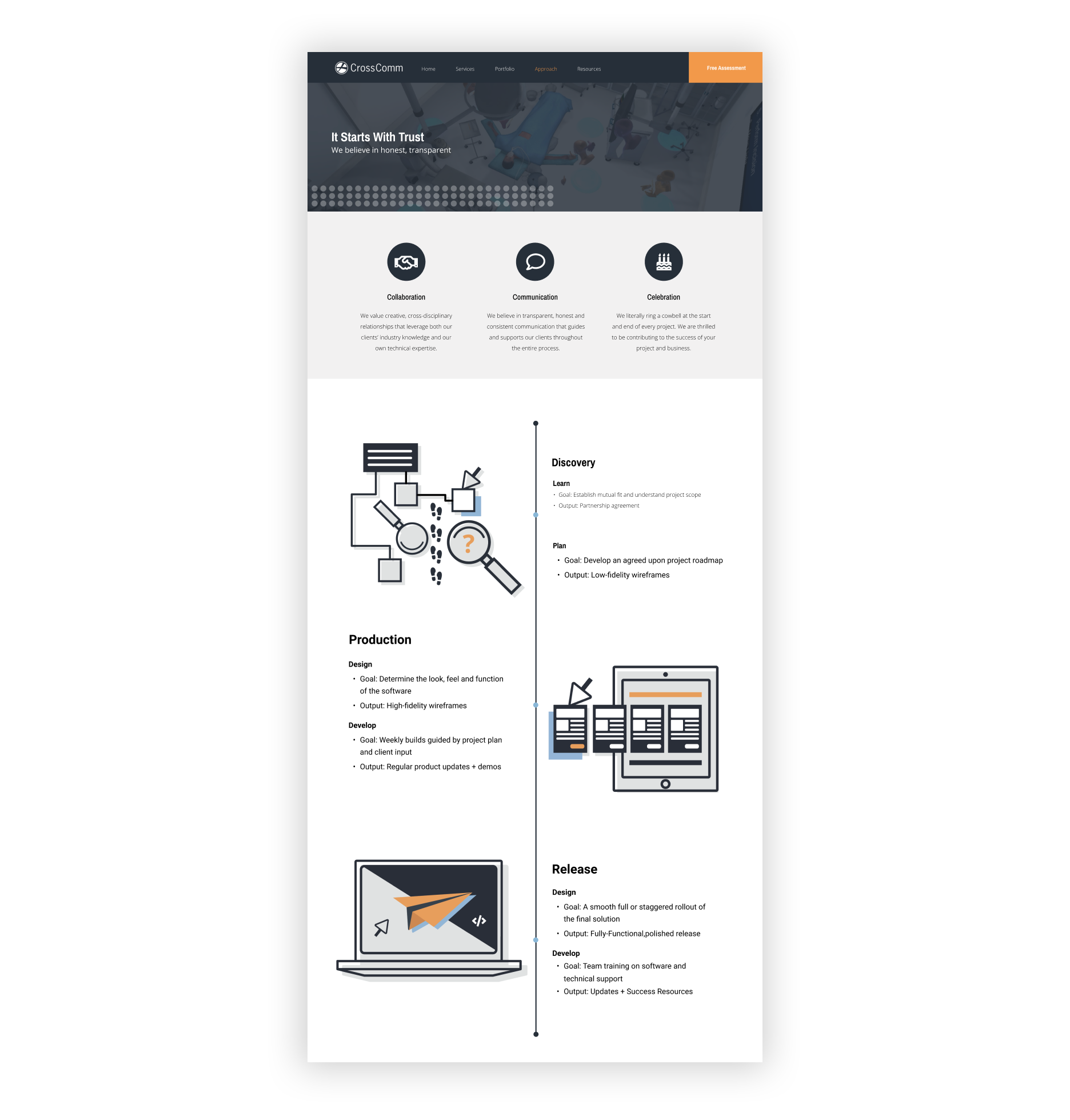
Choosing a software development company is a big commitment. We created the "Approach" page to give potential clients a quick understanding of a typical project workflow so they could better understand what working with CrossComm is like.
An Intuitive and Pleasing User Experience
Good communication is about more than what you say; it's also about how the information is presented. Website visitors must be able to easily find what they are looking for, when they are looking for it, regardless of device or browser. Here are a few ways we sought to make the website more intuitive and easy to navigate.
“Sticky” navigation bar - remains visible and accessible as users scroll the site. Go ahead...try it out!
Formalized portfolio structure - makes portfolio pieces easy to scan for a quicker understanding of a past client's challenge, our approach, and the end result.
Featured sections - Throughout the site there are featured clients, portfolio pieces, and blog entries. Like the “Chef's Favorites” on a restaurant menu, these featured sections are recommendations meant to help users quickly find information of interest.
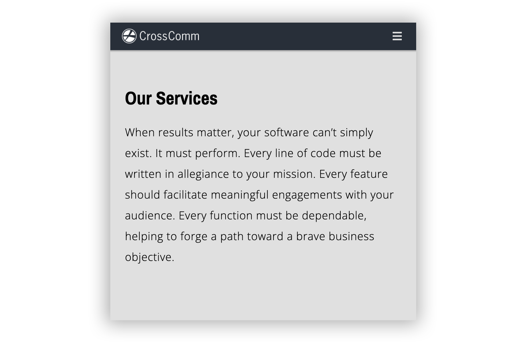
A pleasing mobile experience - all too often the mobile view of websites is treated as an afterthought. Our lead UX/UI designer Darrien did a great job adapting his design for mobile and Zach (one of our developers) added his own tweaks and fine-tuning to make the mobile experience smooth and intuitive.
Flexibility for the Marketing Team
After launching our previous site, we wrote a blog post about our decision to use a content management system (CMS) called Contentful. In our new launch, we doubled down on this decision. While there are certainly other CMS platforms that are more tailored to the non-technical marketer (like myself), Contentful is simply more powerful as a headless CMS.
A headless CMS allows for us to decouple the content of our website from the presentation of that content. By doing so, the content can easily be delivered to not just our website, but any number of platforms and devices, including mobile apps, web apps, or even virtual or augmented reality apps—or even future iterations of our website.
"The tech stack used allowed for us developers to code in what we know, React, at the same time allowing us to build a statically generated site that is fast but also scalable with the use of Contentful as our headless CMS.”
Chad Cooper - Developer
More Editable Sections
Our old site was built so that more frequently updated content pieces like blog posts and portfolio pieces could be added and edited via Contentful, but more static pages (like the "Home" page or "Services" pages) could only be changed with the assistance of a developer.
When our team was made up of mostly developers (and no marketers), this made sense. But now, with a growing content team, it’s important for non-developers to have full ability to refresh elements across the site— including text, pictures, buttons, testimonials, badges, job posts, featured items, and more.
While it took a lot of work from our developers to make the entire website editable through the CMS, it will save time in the long run. My team will have full autonomy in creating and publishing content, and we won’t have to interrupt developers nearly as much while they're working on important client projects.
A Modular Structure
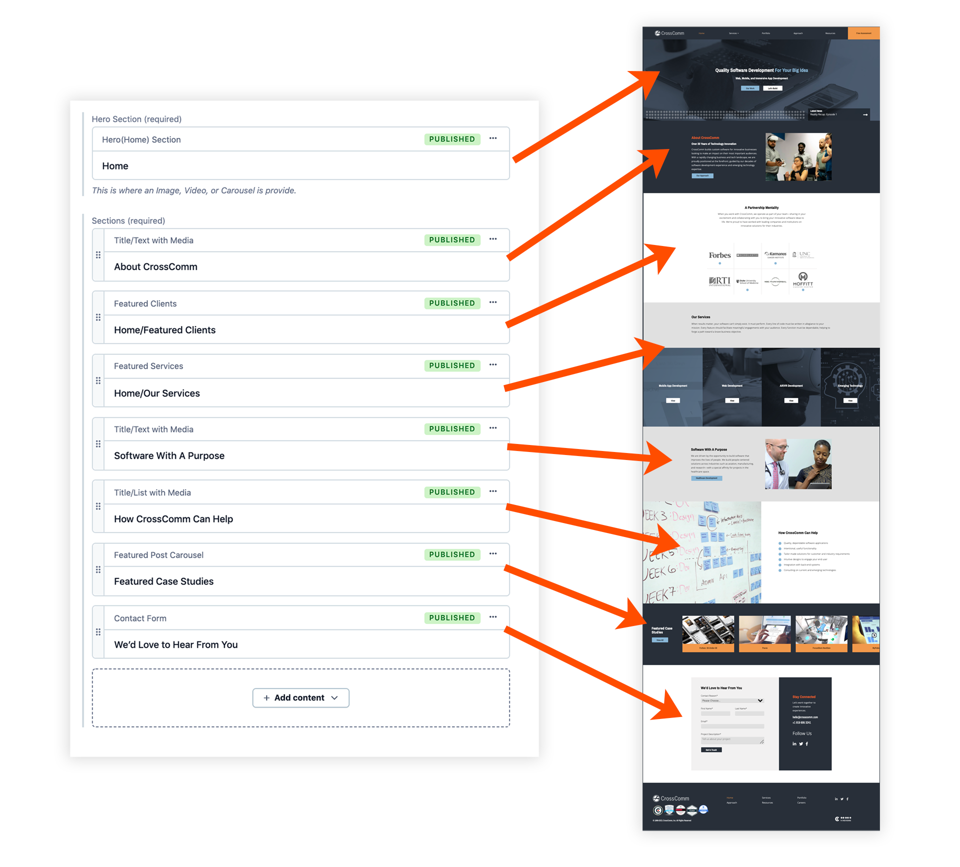
Each page section or “slice” (as we refer to them internally) of our new site is actually is designed based off of a content model within Contentful. In the code, these content models are each given their own rules pertaining to layout and design. In Contentful, sections can easily be added, rearranged, or removed to change the look of a page without needing the help of a developer. In the same way, new pages with new layouts can be built from scratch by assembling these modular “slices” in new ways.
Content sections in Contentful and their associated "slices" on the home page
Richer Content
When we launched our previous website nearly five years ago, we shared that we were beginning to blog as a company in order to share our knowledge with others. This is still our goal, but we now want to apply this thinking to other forms of content as well. In fact, you may have noticed our main blog page is now called “Resources.” This sets the stage for us to share other types of helpful content down the road—including podcasts, webinars, downloadable resources, and more.
Slow down! I’m not committing to launching all of these things...at least not yet...but it was important for our new website to be able to accommodate them if and when we were ready to unfold these new types of content.
To that end, our development team built content models to better handle embedded media like YouTube videos, social media posts, and even audio players. There is even a content model to accommodate downloadable resources. Plus, our developers built new ways to display information, such as stylized lists, image carousels, and code blocks—giving the content team even more options to create interesting and helpful content.
So stay tuned to see what we’re up to! And if there’s anything in particular you would like to see, please let us know. I hope you'll spend a few minutes looking over our new website!
Thanks to my amazing team members who joined me on this task to build our new site:
Darrien Staton (UX/UI Designer)
Chad Cooper (React Developer)
Zach Berry (React Developer)
And special shoutout to Don Shin, Stella Cox, Gabriel Nyante, Sara Battles, and Steve Maxson!

